Thursday, August 12, 2021

Are solar power plants really green energy ? Continuation

This text is a continuation of my reflections on the impact of photovoltaic power plants on climate. In the part Are solar power plants really green energy ? I presented some figures which show that the heat generated by the currently working solar power plants (they produce more than 4 times more thermal energy than they produce in the form of electricity) is such a big part of the heat emitted by humans, that after converting this heat into CO2 amounts, it is more than a half of the effect generated in 2020 on the whole Earth!
This amount of heat energy is unlikely to have no effect on global warming.

More concrete signals that the development of a solar power plant infrastructure could lead to climate disruption and rising temperatures.


  1. Urban Heat Island effect (UHI)

    The UHI is a real phenomenon.
    The paper "The Effect of Urban Heat Island on Climate Warming in the Yangtze River Delta Urban Agglomeration in China" presents the effect of UHI on climate warming based on an analysis of the effects of urbanization rate, urban population and land use change on the warming rate of mean, minimum (night) and maximum (day) air temperature in the Yangtze River Delta (YRD) using observational data from 41 meteorological stations. In conclusion, the authors found that observations of daily mean, minimum, and maximum air temperature atmeasurement stations in the YRDUA from 1957 to 2010 showed significant long-term warming due to background warming and UHI. The warming rate of 0.108 to 0.483°C/decade for mean air temperature is generally consistent with the warming trend in other urban regions in China and other urban areas in the world.
    Thus, the authors showed that urbanization significantly enhanced local climate warming.
    The solar power plants based on photovoltaic panels are even hotter islands of heat than highly urbanized agglomerations. During the period of most intense sunlight, the temperature near a solar power plant can be up to 3 degrees Celsius higher than the temperature in a similar environment without solar panels and similar solar conditions.

    Suggestion:

    The similarity in heat generation between the two cases - densely populated metropolitan areas and solar power plants - suggests the same effect - warming the air over a larger area.
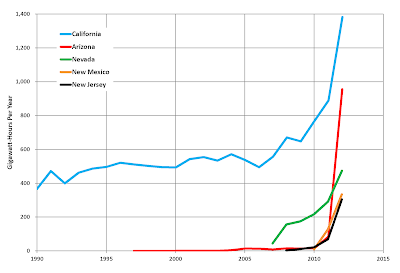
  2. Correlation between Urban Heat Island (UHI) effect and number of heat waves (HW)

    Due to lack of access to data, I have to rely on visual comparisons (if anyone knows data to analyze or can make it common, please contact me).
    Below I illustrate 2 cases: USA and Europe (Germany in particular).

Conclusions:

Without access to detailed data, it is difficult to conduct a more detailed analysis of the correlation between the number of the HW and the increase in electricity produced by the growing number of solar plants.
However, the suggestion given by the available data presented above is at least worth a closer analysis.

The ideas in the European document "Fit for in the a Solar Future: Commission climate package is landmark achievement but more ambition is possible" could prove devastating .


Take care

Sunday, August 8, 2021

Are solar power plants really green energy ?

Are solar power plants really a good solution for energy production ?

Everywhere you hear it's a clean way to get energy. So let's see if it really is.

Introduction:


As an introduction, a few words about how the sun heats the earth and how a solar panel works.
The infrared part of the solar spectrum (wavelength > 700 nm, about 50% of the energy) is directly responsible for heating the Earth's surface and air. This kind of solar radiation exposure on the Earth is considered normal.
Photovoltaic (PV) panels operate in the visible part of the solar spectrum: from 350 nm to 750 nm (approximately). It is this part of the solar spectrum that does not normally heat the environment (the part between 700 and 750 nm does). Energy from this range of radiation is partially (14-22%) converted into electrical energy and the rest (78-86%) is converted into thermal energy.
PVs thus act as a converter of the visible part of the sunlight spectrum (not infrared) to heat (infrared). In other words, they increase the amount of heat compared to the transmitted infrared portion of sunlight. To simplify the estimation, let's assume that 16% of the energy consumed by PV is converted into electrical energy. The rest is dissipated in a form of heat. Data about the operational power produced by solar panels are given in units of electric power generated by Photovoltaic (PV) systems. I.e. 84% of the energy dissipated into heat is not included in these values.

Story nr 1 - local:


The first bad effect, fully local one, is a local increase of temperature near solar power plants The Photovoltaic Heat Island Effect: Larger solar power plants increase local temperatures. Another interesting article about a super solar power plant in the Sahara, taking into account the local effects of large heat dissipation around solar panels was written by Jack Marley Solar panels in Sahara could boost renewable energy but damage the global climate – here’s why.

Story nr 2 - global:


Now let's try to look at things globally.
the number of solar panels on earth is growing almost exponentially every year. According to the Renewable Capacity Statistics 2021 website, at 12.2.2021 the world had 714 GW of operational Photovoltaic (PV) systems. Let's try to translate this value into a carbon footprint by treating all operating PV systems as one.
Some assumptions at the beginning:
  1. 80% of initial radiation is dissipated by the solar panel into heat.
  2. 1 kW of Solar Panel System covers an area about 8 m2 .
  3. Solar irradiance: the averaged over the year and the day, the Earth's atmosphere receives radiation 340 W/m2 from the sun https://en.wikipedia.org/wiki/Solar_irradiance. The PV systems are distributed across the earth, so I assume that the average solar radiation used in the calculations is: 150 W/m2
  4. Average equivalent of the carbon footprint of the 1 kWh as 0.5 . Obviously, we have different CO2 emission intensity for different countries per 1 kwh. The value 0.5 corresponds to the average values over sunny countries.
    More detailed data by country and region is available on the website https://www.carbonfootprint.com/.
  5. Conversion from W to kWh: 1 W == 0.001 kWh


The 714 GW of operational PV systems creates a total surface (St) equal to: St = 5712000000000 m2 = 5 712 000 km2 .
It corresponds to the area size between India (3 287 263 km2) and Australia (7 741 220 km2). Going furthermore, considering the surface of the earth, the surface of the solar panels is 1.1% of its surface. Since we are talking about energy produced by the operational PV systems, we can assume that this is 16% of the energy converted into electricity. Therefore, the dissipated energy into the heat energy (Ht) produced at the same time is:

Ht = 714 [GW] (84 [%]/16 [%]) = 3748.5 [GW].
Now let's calculate the carbon footprint of this amount of heat. Using the conversion from W to kWh (1 W == 0.001 kWh), our amount of heat energy (Ht) is equivalent to 3 748 500 000 kWh ~ 3.75 GWh .

This value corresponds to the carbon footprint (assumption that the carbon footprint of the 1 kWh is 0.5):.
1874250000 kg CO2 /hour.
or
16 418 430 000 000 kg CO2 / year ~ 16.4 GT /year.
This is a huge value and corresponds to the 52% (!) of total CO2 emission in 2020 (31.5 GT / year) ! Thus, we have an unexpected situation because it looks like solar panels are far worse at producing energy than fossil fuels. Let's see a comparison of the increase in operational energy of PV systems to the change in global temperature anomaly as a function of years. Temperature data from https://climate.nasa.gov/vital-signs/global-temperature/.
Please note the different scales of the data presented in the figure. The operational power generated by solar panels is shown in red, the temperature anomalies in blue. Almost perfect correlation !

Summary:


  1. Is CO2 really responsible for warming the earth ?
  2. The correlation between temperature anomalies and the amount of energy produced by PV systems is surprising to say the least !
  3. By building PV systems, we create smaller or larger heat islands around them, disturbing the natural energy balance in such an area. The PV systems produce more than 4 times more thermal energy than they produce in the form of electricity.
  4. By producing solar panels we pollute our environment (+ the need to recycle).


The final conclusions rather indicate that solar power plants do more damage than conventional ones.

Now, the natural question is whether we are already seeing a correlation of climate change with the increase in heat islands around solar power plants.
  1. Is there a correlation between the heat energy produced by the increasing number of solar plants and the increase in air temperature via the Heat Islands effect ?
  2. Is there a correlation between the frequency of Heat Waves and the thermal energy produced by solar power plants ?
About this there is the next text Are solar power plants really green energy ? Continuation

I would be grateful if someone could point out to me the error I am making in the above approximations.

Take care

Thursday, July 15, 2021

Global Real Estate market: a non-expert view

About:
Most analyses of real estate prices compare their behavior over time with other economic indicators, but this is done for a specific country or independently for a group of countries. This text proposes a comparison of real estate prices between different countries by calculating the correlation between them.

Data:
I came across some data on real estate prices (https://data.world/finance/international-house-price-database). This data contains values of 4 quantities (with short descriptions found in wikipedia and other sources):
  1. the house price index (HPI):
    measures the price changes of residential housing as a percentage change from some specific start date (starting in 1975).
  2. the house price index expressed in real terms (RHPI):
    the deflated house price index (or real house price index) is the ratio between the house price index (HPI)
  3. the personal disposable income index (PDI):
    measures the after-tax income of persons and nonprofit corporations.
  4. It is calculated by subtracting personal tax and nontax payments from personal income.
  5. the personal disposable income expressed in real terms index (RPDI) :
    the deflated PDI.


Analysis:
As input we have time series with specified quantity $Q$ (HPI, RHPI, PDI or RPDI) for N (N=24) countries ( 'Australia', 'Belgium', 'Canada', 'Switzerland', 'Germany', 'Denmark', 'Spain', 'Finland', 'France', 'UK', 'Ireland', 'Italy', 'Japan', 'S. Korea', 'Luxembourg', 'Netherlands', 'Norway', 'New Zealand', 'Sweden', 'US', 'S. Africa', 'Croatia', 'Israel', 'Slovenia'). In order to calculate correlations between countries I do the following calculations:
  1. for a given quantity $Q$ I normalize all data independently to the range [0,1],
  2. I determine the two-site correlation function for each timestamp $t$ \begin{equation} \label{1} Corr_{country, another\_country} \left(t \right) = Q_{country}\left(t \right) Q_{another\_country}\left(t \right) \end{equation} which is used finaly, for calculation of the global correlation for each country: \begin{equation} \label{2} C_{country}\left(t \right) = \frac{\sum_{another\_country=1}^{N} Corr_{country, another\_country} \left(t \right) }{N} \end{equation}

The dynamics of the thus calculated correlation function $C_{country}\left(t \right)$ for the quantity $Q=$RHPI and for all countries is shown in Figure 1. For the quantity RHPI, the correlations are most apparent.
The financial crisis of 2008 is very well visible in this figure (the yellow cylinder between 2007 and 2008).

A couple of observations for the time period 2007-2008:
The longest increase of the value of RHPI is seen for the US, lasting since about 1995. Other countries behave in a weakly correlated way during this period. A strong correlation between countries starts to be visible from about 2005 and quickly increases until the crash around 2007-2008. It looks as if most countries joined the global real estate market at the same time (around 2005) and at a given signal decided to crash - "ready, steady, crash!". The market seems to be too well orchestrated. I know that some people will say that this is a normal behavior because it is a global market, all markets are interconnected, etc. However, please note that it is hard to see any trace of the dot-com crisis of 2000-2003 (dot-com bubble) in this picture. Another comment on the picture concerns the number of countries participating in the crash. There are some countries excluded (Japan, S. Korea, Israel) or weakly participating in the process (Australia, Canada, Switzerland, Germany, New Zealand, Sweden, Croatia). Altogether, 13 countries out of 24 are affected by the crash.

Observations for the time period 2008-now:
The first observation is that more countries are now correlated (and not because of COVID). Still outside the correlated market are Japan, S. Korea and Croatia. Spain, Italy are not correlated (accident at work?).

Summary:
the management of the real estate market is becoming more and more concise (only one player? ): currently 19 countries out of 24 (crisis 2008: 13 countries).
Question: when will this player decide to make another crash?

If anyone has knowledge of more data I would be grateful for providing it.

Friday, May 14, 2021

Semantic Search: Too many or too few matching pairs ? Dynamically determined selection threshold for matched query pairs

In my recent projects on applying Natural language processing (NLP) methods, a large part is based or contains parts based on semantic search. In a nutshell, we have certain queries (phrases or sentences) on one side and a set of other texts on the other side and our goal is to find the best matching texts to our query. Simply writing, we need to perform semantic search on our data set.

For those who are less familiar with semantic search, let me define the term as:
a kind of lexical comparison of two texts with dominant part of understanding the content of words and phrases, and relations between words or phrases in queries being compared.

While working with semantic search, I encountered a problem with defining the acceptance threshold for my findings. This problem becomes significant when the texts being compared are of significantly different lengths and/or contain significantly different degrees of content. In other words, the problem becomes serious when we deal with the so-called asymmetric semantic search https://www.sbert.net/examples/applications/semantic-search/README.html#symmetric-vs-asymmetric-semantic-search.

In the following, I would like to share a method which allows to dynamically determine the acceptance threshold of found pairs of matched entries. This method may determine the final solution or be a prelude to a more modified version. The project code is available on my Github account "https://github.com/Lobodzinski/Semantic_Search__dynamical_estimation_of_the_cut_of_for_selected_matches".

Let's start describing the method.
  • The data:
    As an experiment I will use reuters data, known as reuters-21578 (https://paperswithcode.com/dataset/reuters-21578). While searching for an answer to our query, we should try to be as precise as possible in formulating the questions. However, sometimes it is not possible. For the purpose of this mini-project, let's formulate our queries in a general form.
    'Behavior of the precious metals market',
    'What is the situation in metal mines',
    'Should fuel prices expect to rise ?',
    'Will food prices rise in the near future ?',
    'I am looking for information about food crops.',
    'Information on the shipbuilding industry'
  • Generation of matched pairs between the queries and the Reuter's texts:
    Our goal is to perform a semantic search. First, we need to generate matching text pairs. In the following I will use the code that is part of the sentence-transformers package "https://github.com/UKPLab/sentence-transformers/tree/master/examples/applications/semantic-search".
  • Similarities and the threshold calculation:
    Having calculated the similarity values, we can move to the main point - choosing the similarity threshold. First, let's look at the similarity plot in the test function for a fixed query ('What is the situation in metal mines ?')
    It is obvious that not all matches shown in the Figure are good (acceptable). So how to choose the threshold value of similarity ?
    The proposed method is fully heuristic and is based on the calculation of the elbow point of the curve of the similarity as a function of the matched text. If we take a look at the examined functional relationship, we can see that this curve (almost always) has an elbow point beyond which the similarity between the found texts and our query changes very slowly. To calculate the "cut off" point (elbow point) I used the KneeLocator package ("https://pypi.org/project/kneed/"). The function KneeLocator ("https://kneed.readthedocs.io/en/stable/parameters.html#s") contains a sensitivity parameter S which can be used to better select our elbow point.
    The following code and its output shows the details of the calculation and its results. For details, please check "https://github.com/Lobodzinski/Semantic_Search__dynamical_estimation_of_the_cut_of_for_selected_matches".
    .

    This part, for each query reads all matched sentences gathered from the Reuters data together with calculated similarities. The threshold is calculated by the function KneeLocator, this part is denoteb by bold text in the code below.
    
    # loop over our list of queries:
    for query in result_df['query'].unique():
    
    	sentences_ = result_df[(result_df['query'] == query)]['sentence'].values
        x = []
        for y_ in sentences_:
        	x.append(y_[:60]+'...')
        
       	
        # similarities between the query and the matched Reuter's texts:
        y1 = result_df[(result_df['query'] == query)]['score'].values
        
        # determne elbow value:  
        x0 = list(range(len(y1)))
                
        kn = KneeLocator(x0, y1, S=1., curve='convex', direction='decreasing') 
        elbow_1 = kn.knee
        print ('Elbow point values:\n tekst_id=', elbow_1, \
                		'; threshold value=',y1[elbow_1])


    Resulting value (the threshold point) is presented on the next Figure :

    So, for our query ('What is the situation in metal mines ?'), we found 14 texts in the Reuter's set. Below I have copied the first 3 and last 2 texts from the set of accepted texts (the whole set is too long to present here). The reader can judge for themselves the similarity between the query and the text.
    For comparison, I have also added the text which is not accepted (15), which is not accepted by this method.
    Accepted texts:
    1
    SIX KILLED IN SOUTH AFRICAN GOLD MINE ACCIDENT Six black miners have been killed and two injured in a rock fall three km underground at a South African gold mine, the owners said on Sunday. lt Rand Mines Properties Ltd>, one of South Africa s big six mining companies, said in a statement that the accident occurred on Saturday morning at the lt East Rand Proprietary Mines Ltd> mine at Boksburg, 25 km east of Johannesburg. A company spokesman could not elaborate on the short statement.
    2
    NORANDA BEGINS SALVAGE OPERATIONS AT MURDOCHVILLE lt Noranda Inc> said it began salvage operations at its Murdochville, Quebec, mine, where a fire last week killed one miner and caused 10 mln dlrs in damage. Another 56 miners were trapped underground for as long as 24 hours before they were brought to safety. Noranda said the cause and full extent of the damage is still unknown but said it does know that the fire destroyed 6,000 feet of conveyor belt. Noranda said work crews have begun securing the ramp leading into the zone where the fire was located. The company said extreme heat from the fire caused severe rock degradation along several ramps and drifts in the mine. Noranda estimated that the securing operation for the zone will not be completed before the end of April. Noranda said the Quebec Health and Safety Commission, the Quebec Provincial Police and Noranda itself are each conducting an investigation into the fire. Production at the mine has been suspended until the investigations are complete. The copper mine and smelter produced 72,000 tons of copper anodes in 1986 and employs 680 people. The smelter continues to operate with available concentrate from stockpiled supplies, Noranda said. Reuter
    3
    NORTHGATE QUEBEC GOLD WORKERS END STRIKE Northgate Exploration Ltd said hourly paid workers at its two Chibougamau, Quebec mines voted on the weekend to accept a new three year contract offer and returned to work today after a one month strike. It said the workers, represented by United Steelworkers of America, would receive a 1.21 dlr an hour pay raise over the life of the new contract and improved benefits. Northgate, which produced 23,400 ounces of gold in first quarter, said that while the strike slowed production, We are still looking forward to a very satisfactory performance. The Chibougamau mines produced 81,500 ounces of gold last year.
    ....
    13
    NORANDA BRUNSWICK MINERS VOTE MONDAY ON CONTRACT Noranda Inc said 1,100 unionized workers at its 63 pct owned Brunswick Mining and Smelter Corp lead zinc mine in New Brunswick would start voting Monday on a tentative contract pact. Company official Andre Fortier said We are hopeful that we can settle without any kind of work interruption. Fortier added that Brunswick s estimated 500 unionized smelter workers were currently meeting about a Noranda contract proposal and would probably vote next week. The mine s contract expires July 1 and the smelter s on July 21. The Brunswick mine produced 413,800 tonnes of zinc and 206,000 tonnes of lead last year at a recovery rate of 70.5 pct zinc and 55.6 pct lead. Concentrates produced were 238,000 tonnes of zinc and 81,000 tonnes of lead.
    14
    COMINCO lt CLT> SETS TENTATIVE TALKS ON STRIKE Cominco Ltd said it set tentative talks with three striking union locals that rejected on Saturday a three year contract offer at Cominco s Trail and Kimberley, British Columbia lead zinc operations. The locals, part of United Steelworkers of America, represent 2,600 production and maintenance workers. No date has been set for the talks, the spokesman replied to a query. The spokesman said talks were still ongoing with the two other striking locals, representing 600 office and technical workers. Production at Trail and Kimberley has been shut down since the strike started May 9. Each of the five locals has a separate contract that expired April 30, but the main issues are similar. The Trail smelter produced 240,000 long tons of zinc and 110,000 long tons of lead last year, while the Sullivan mine at Kimberley produced 2.2 mln long tons of ore last year, most for processing at Trail. Revenues from Trail s smelter totaled 356 mln Canadian dlrs in 1986.


    Not Accepted texts:
    15
    VESSEL LOST IN PACIFIC WAS CARRYING LEAD The 37,635 deadweight tonnes bulk carrier Cumberlande, which sank in the South Pacific last Friday, was carrying a cargo which included lead as well as magnesium ore, a Lloyds Shipping Intelligence spokesman said. He was unable to confirm the tonnages involved. Trade reports circulating the London Metal Exchange said the vessel, en route to New Orleans from Newcastle, New South Wales, had been carrying 10,000 tonnes of lead concentrates. Traders said this pushed lead prices higher in early morning trading as the market is currently sensitive to any fundamental news due to its finely balanced supply demand position and low stocks. Trade sources said that 10,000 tonnes of lead concentrates could convert to around 5,000 tonnes of metal, although this depended on the quality of the concentrates. A loss of this size could cause a gap in the supply pipeline, particularly in North America, they noted. Supplies there have been very tight this year and there is a strike at one major producer, Cominco, and labour talks currently being held at another, Noranda subsidiary Brunswick Mining and Smelting Ltd.
    16
    LTV lt QLTV> TO NEGOTIATE WITH STEELWORKERS LTV Corp s LTV Steel Corp said it agreed to resume negotiations with the United Steelworkers of America at the local plant levels, to discuss those provisions of its proposal that require local implementation. The local steelworker union narrowly rejected a tentative agreement with the company on May 14, it said. LTV also said it agreed to reopen its offer contained in the tentative agreement reached with the union s negotiating committee as part of a plan to resolve problems through local discussions.


    As you can see, the unaccepted texts are not directly related to mining, which is what we are asking about in our query.


Thanks for reading, please feel free to comment and ask questions if anything is unclear.

Wednesday, April 7, 2021

Weird aspects of ARIMA - how to increase the accuracy of predictions by exogenous data

ARIMA models are commonly used to predict time series. Most importantly, if the ARIMA model is properly chosen, the prediction error is often so small that it is a very difficult task to find better predictions using more sophisticated methods. Since this is not a note about an introduction to ARIMA models I replace the typical introduction to the models with this link which describes the method much better: Forecasting: Principles and Practice" (2nd ed) by Rob J Hyndman and George Athanasopoulos (https://otexts.com/fpp2/).
One of the variants of ARIMA models is a version using exogeneous data, to which this note is dedicated.
It is not widely known that this version of ARIMA models is strongly dependent on the factor by which we multiply the exogeneous data. Generalizing, we can say that the larger the factor, the smaller the prediction error of the model.

To begin with, let us start with a heuristic proof that the factor determining the ratio between the exogeneous data and the target, can influence the prediction error of the algorithm.

For simplicity, let us omit the part of the time series description which in ARIMA models is responsible for the differentiable part, i.e. we assume that the parameter $d=0$. In other words, we will use the formulations of the ARMAX model.
Then, a given time series X, in ARMAX, can be expressed generally as: \begin{equation} \label{eq1} X_{t}= c + \epsilon_{t} + AR_{t} + MA_{t} + exog_{t} \end{equation} where $c$: constant, $\epsilon_{t}$: white noise, $AR_{t}$: Autoregression part, $MA_{t}$: Moving average part, $exog_{t}$: exogeneous variable(s).
Now, let's define the exogeneous part $exog_{t}$ as: \begin{equation} \label{eq2} exog_{t} = X_{t} \alpha + \gamma_{t} \end{equation} where $\alpha$ is some proportionality factor, $\gamma_{t}$ - white nose.
Therefore, introducing eq. \ref{eq2} to eq. \ref{eq1} we will get: \begin{equation} \label{eq3} X_{t} = c + \epsilon_{t} + AR_{t} + MA_{t} + X_{t} \alpha + \gamma_{t} \end{equation} And after rearranging some terms \begin{equation} \label{eq4} X_{t}\left(1-\alpha\right) = c + \left(\epsilon_{t} + \gamma_{t}\right) + AR_{t} + MA_{t} \end{equation} But the part $AR_{t}$ can be written as $AR_{t} = \sum_{i}^{p} \phi_{i} X_{t-i}$ and similarly the $MA_{t}$ component $MA_{t} = \langle X \rangle + \beta_{t} + \sum_{i}^{q} \theta_{i} \beta_{t-i}$ with: $\beta_{n}$ as a white noise, $ \langle X \rangle $ - the expectation value of the $X$, $\theta_{i}$ - parameters of the model.
With the above in mind, the eq \ref{eq4} becomes : \begin{equation} \label{eq5} X_{t} = \frac{c + \epsilon_{t} + \gamma_{t} + \alpha \langle X \rangle}{1-\alpha} + \sum_{i} \hat{\phi}_{i} X_{t-i} + \langle X \rangle + \hat{\beta}_{t} + \sum_{i} \theta_{i} \hat{\beta}_{t-i} \end{equation} where I introduced notation: $\hat{\beta}_{t-i} = \frac{\beta_{t-i}}{1-\alpha}$, $\hat{\phi}_{i} = \frac{\phi_{i}}{1-\alpha}$ and $\hat{\theta}_{i} = \frac{\theta_{i}}{1-\alpha}$.
Using definitiona of the $AR_{t}$ and $MA_{t}$ we can rewrite eq \ref{eq5} into the final form: \begin{equation} \label{eq6} X_{t} = \frac{c + \epsilon_{t} + \gamma_{t} + \alpha \langle X \rangle}{1-\alpha} + \hat{AR}_{t} + \hat{MA}_{t} \end{equation} where components $\hat{AR}_{t}$ and $\hat{MA}_{t}$ correspond to the definitions $AR_{t}$ and $MA_{t}$ but with $\hat{\phi}$, $\hat{\theta}$ and $\hat{\beta}$ coefficients.
The first component of Equation \ref{eq6} is the most interesting !.
In the case of ARIMA without exogeneous data, the forecasting error is determined by the $\epsilon$ . Now, this error is replaced by the expression \begin{equation} \label{eq7} \epsilon_{t} \longrightarrow \frac{\epsilon_{t} + \gamma_{t}}{1-\alpha} \end{equation}
This is how we reached our final conclusions:
  1. use exogenous variables that are highly correlated ($\alpha \approx 1.$) or anti-correlated ($\alpha \approx -1.$) with the target is equivalent to a model without exogenous variables (but with changed model parameters).
  2. the use of exog data, scaled by the ratio $\frac{exogenous data}{target}$ allows for a significant modification of the final prediction error of the model. The error is now scaled by the factor $\frac{1}{1-\alpha}$. So
    1. we have the error explosions for $\left|\alpha\right| \approx 1$,
    2. for $\left|\alpha\right| < 1 $: error with exog data $>$ error without exogenous variable,
    3. for $\left|\alpha\right| > 1 $: error with exog data $<$ error without exogenous variable.
The above derivation was made for the simplified case without the differential term (i.e., when $d,D=0$). I leave it to the readers to generalize the above formalism into a model with a differential parts.


The next step will be a verification of these hypotheses in practice. A practical example of the implementation of the discussed hypothesis is available in the form of a jupyter-notebook script: https://github.com/Lobodzinski/ARIMA_with_exogenous_data.
Here, we just present the dependence of the MAPE error as a function of the exog data factor (in the log10 scale). As you can see, by using an appropriate value of the factor we are able to reduce the prediction error by almost half ! The error reaches its minimum value at a factor value of 4000000. Then the error increases. The increasing part after the minimum is reached is not directly visible in the theoretical proof. I will try to explain it in the next part of the article.
All other details are available in the code: https://github.com/Lobodzinski/ARIMA_with_exogenous_data.


Thank you for the reading !