Predictive maintenance solution for industrial systems -- an unsupervised approach based on log periodic power law
author: Bogdan Łobodziński
Arxiv article: arXiv:2408.05231 [stat.AP]
Abstract:
A new unsupervised predictive maintenance analysis method based on the
renormalization group approach used to discover critical behavior in complex
systems has been proposed. The algorithm analyzes univariate time series and
detects critical points based on a newly proposed theorem that identifies
critical points using a Log Periodic Power Law function fits. Application of a
new algo- rithm for predictive maintenance analysis of industrial data
collected from reciprocating compressor systems is presented. Based on the
knowledge of the dynamics of the analyzed compressor system, the proposed
algorithm predicts valve and piston rod seal failures well in advance.
Keywords: Failure Prediction; Predictive Maintenance; Time Series;
Unsupervised Analysis; Renormalization group; Critical Systems; Log Periodic
Power Law; Reciprocating compressors
Overview of the article
Main goal of the work
The goal of the paper is to present a methodology for describing critical behavior in complex systems based on the renormalization group approach in unsupervised predictive maintenance, specifically demonstrating the effectiveness of the algorithm for industrial applications using time series data from a monitored reciprocating compressor.The key results
The key results of the work include the development and application of a new unsupervised predictive maintenance analysis method based on the renormalization group approach, specifically using a Log Periodic Power Law (LPPL) function to predict failures in reciprocating compressor systems and other industrial complex systems. The method effectively identifies critical points in time series data, determines the time window in which predicted failures may occur, and classifies the predicted failures based on the goodness of fit of the LPPL curve to the data. The results demonstrate the ability to predict serious failures with a fitting error below a defined threshold and to identify less critical failures that do not require immediate intervention.The advantage of the presented method over supervised ML methods
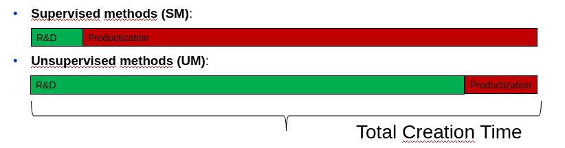
- The main advantage of the presented method over supervised ML methods is that it does not require labeled data, making it suitable for applications where labeled data is scarce or unavailable. This unsupervised approach allows for the detection of critical behavior in complex systems without prior knowledge of the system's normal or anomalous states.- The proposed method is based on functional similarity rather than numerical values as available ML methods.
- The method searches for common functional behavior, making it applicable to very short time series and data that describe physical processes degrading due to perturbations.
- The proposed solution greatly simplifies the final production pipelnie. There is no need to monitor the data used in the model, as the most challenging part is fitting the function to the data. - The proposed model can be applied to very short time series - in the presented case of the reciprocating compressor, the minimum length of the series is only 101 points.
Requirements to apply the presented model in practice
To apply the presented model in practice, one would need-access to time series data representing the physical behavior of the system being monitored. The data should describe a physical process that degrades or changes due to perturbations introduced by interacting elements. - Individualized adjustment of the ranges of change of parameters to be matched in the LPPL function is required based on the dynamic characteristics of the monitored device.
- The time step of the input time series should be selected to be consistent with the dynamic characteristics of the monitored device.
 Visualization of the results of the proposed method. The figure shows
annotations describing failures predicted by the algorithm - colored text
(different from gray and black), reasons for compressor repair - black text
and diagnosed compressor abnormal behavior requiring monitoring - gray text.
For better visualization, the areas of diagnosed compressor abnormal behavior
that require monitoring are displayed in the “Monitored event” category.
Visualization of the results of the proposed method. The figure shows
annotations describing failures predicted by the algorithm - colored text
(different from gray and black), reasons for compressor repair - black text
and diagnosed compressor abnormal behavior requiring monitoring - gray text.
For better visualization, the areas of diagnosed compressor abnormal behavior
that require monitoring are displayed in the “Monitored event” category.
If any reader would be interested in using the model, do not hesitate to contact me.